Responsive Web Design: Why It’s a Must for NZ Mobile Users.
Discover why responsive web design is essential for catering to New Zealand’s growing mobile user base and how it impacts user experience, SEO, and conversions.
- Digital Sphere
Introduction
In New Zealand, mobile devices are an essential part of daily life. With more users accessing websites from their smartphones than ever before, ensuring your site is mobile-friendly is a top priority.
This is where responsive web design comes into play.
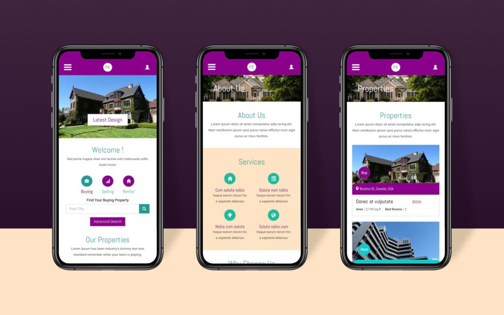
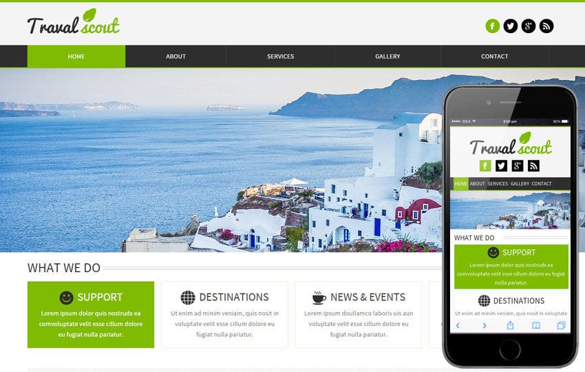
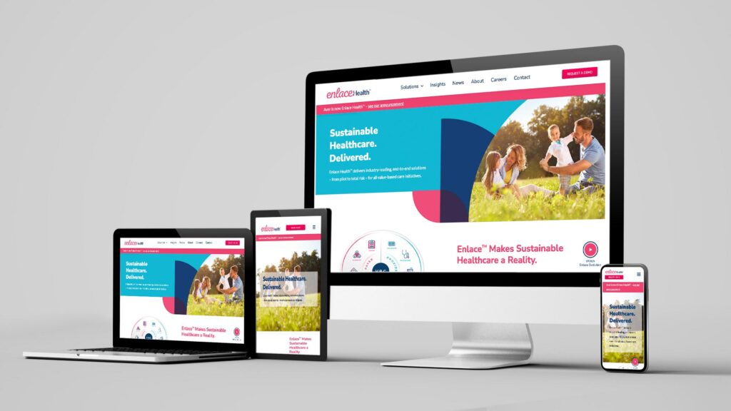
What is Responsive Web Design?
Responsive web design refers to the approach of designing websites that automatically adjust their layout and content according to the screen size and device being used. Whether your visitors are browsing from a desktop, tablet, or smartphone, the experience should be seamless and engaging.
Why Mobile-First is Critical in NZ
- Growing Mobile Usage:
In New Zealand, over 80% of internet users access websites through mobile devices. Ignoring this demographic means missing out on a huge portion of potential customers. - Better User Experience:
A responsive design ensures that your visitors have a consistent experience across all devices. This increases user engagement and reduces bounce rates. - Faster Load Times:
Mobile-first sites are designed to load faster, offering a better experience for mobile users who are often on the go and might not have fast internet access.
Best Practices for Mobile Optimization
1. Simplified Navigation: On mobile devices, smaller screens mean users need to find what they’re looking for quickly. Keep navigation menus simple and easy to use.
2. Responsive Images: Images should scale to fit different screen sizes without causing long load times. Use image formats that compress without losing quality.
3. Mobile-Friendly Forms: Forms are crucial for conversions, but they should be short, easy to complete, and formatted for mobile. Avoid requiring too much typing or long input fields.
4. Touchscreen Functionality: Make sure buttons are large enough to be tapped on mobile screens and links are easy to click without zooming in.
5. Use of Accelerated Mobile Pages (AMP): AMP is a Google-backed project designed to make mobile pages load faster, improving user experience and SEO.
Impact of Responsive Design on SEO
Responsive web design isn’t just good for user experience; it’s also great for SEO. Google has clearly stated that mobile-friendly websites are ranked higher in search results.
- Mobile-First Indexing:
Google’s mobile-first indexing means that the search engine uses the mobile version of your site for ranking. A non-responsive site risks being penalized. - Reduced Bounce Rate:
With a responsive design, your visitors won’t be frustrated with poor loading speeds or awkward layouts, meaning they are more likely to stay on your site longer. - Improved Conversion Rates:
A mobile-optimized site leads to higher conversion rates as users find it easier to navigate and interact with the site on their devices.
Conclusion
As mobile usage continues to rise in New Zealand, having a responsive web design is no longer optional; it’s a necessity. By prioritizing mobile-first design principles, you ensure your site provides a smooth experience for all users, ultimately improving your SEO and conversions.
Need help optimizing your website for mobile users? Digital Sphere offers expert web development services tailored for the New Zealand market.
📞 Let’s talk strategy! Book a digital marketing audit at Digital Sphere